The living mark.
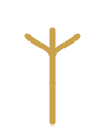
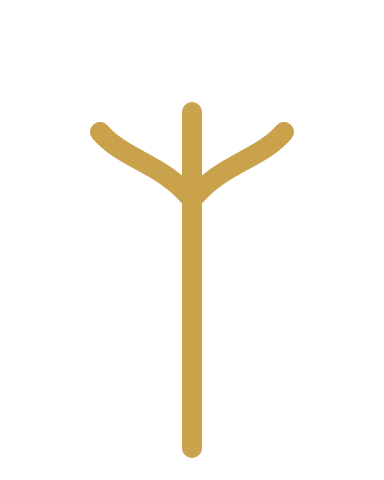
Ghafah Group is a tree. Roots that reach hidden water, a trunk that holds, a canopy that shelters. The mark carries the whole idea in five strokes — and reaches, at its tip, toward the water table below.
The companies
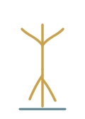
Three strokes rising and spreading — the branches, each reaching into a sector, Ghafah Technologies at the highest point.
The Group
One vertical line holding everything together. Stable, upright, singular — the structure the branches depend on.
The vision
A single root descending past the canopy’s height to a faint aquifer line — Zayed’s vision, thirty metres down, feeding all of it.
Horizontal and stacked, on Deep and Bone. Arabic is authored, never a mirror of the Latin.
Clear space ≥ the height of the mark on every side. Never crowd it.
Minimum 24px for the mark, 16px favicon. Stroke weight thickens as size drops so the Ghaf stays legible.
≈ 70% Deep · 22% Bone · 6% green + aquifer · 2% brass. Scarcity is what makes brass read as gold.
Clean, current, engineered — the next-gen voice. Body copy is plain and specific; measure stays near 68 characters.
واضحة، معاصرة، مهندَسة — صوت الجيل القادم. النصّ مباشر ومحدّد، وسطر القراءة قريب من ٦٨ حرفاً.
The mark alone, in a rounded tile. Brass on Deep is primary; a reversed ink-on-brass tile is permitted for light contexts. Stroke thickens with each step down.
- —Use brass on quiet, deep fields.
- —Scale proportionally — always.
- —Give it generous clear space.
- —Use ink-on-bone for light contexts.
- —Stretch or distort the proportions.
- —Recolour outside the palette.
- —Add shadows, gradients or glow.
- —Set brass as body text.
- —Rotate it or crowd it with other marks.
One moment on load — not scattered effects. The mark draws itself: taproot first, then trunk, then canopy, in the order the story is told.
- 01The taproot descends toward the water table.
- 02The trunk rises — the Group takes hold.
- 03The canopy spreads — the companies reach out.
Draw 520ms · stagger 170ms · cubic-bezier(0.22, 1, 0.36, 1). Reduced motion renders the mark fully drawn, instantly.
Vector sources (SVG) plus a PNG raster for handoff. Fonts must be installed to render the wordmark files.


The mark, at work.
The identity applied to the artifacts a group actually uses — a card, a letter, a signature, a share image, a title slide. Same five strokes, same quiet discipline, everywhere.
85.6 × 54 mm. Wordmark on the face, details in mono on the reverse, Arabic authored as its own side.
85.6 × 54 MM · 2PT BRASS HAIRLINE · MARK ≥ 12MM
A4. Horizontal lockup, a single brass hairline, the address in mono, and the water-table line closing the page.
A compact block for mail clients. Mark, name, then contact in mono — one brass rule between. Light is default; deep is permitted.
The avatar is the glyph alone; the share card carries the wordmark and one line. 1200 × 630 for Open Graph.
A cover and a section divider. Fraunces title, mono index, and the tree kept faint behind it all.